Side project · 2026
Wrestl
A home for pro-wrestling fans, with news, show ratings, podcasts and events in one ad-light app that needs no sign-up. I designed it, branded it and built it.
- Role
- Sole designer & developer
- Platforms
- Web, Android, iOS (in progress)
- Tools
- Figma, Photoshop, Next.js, Kotlin, SwiftUI
- Status
- Live on wrestl.app & Google Play
The problem
Wrestling news is scattered across a dozen sites, most buried under ads and autoplay video. Fans keep a mental list of where to look, then go elsewhere again for podcasts, PPV dates and to argue about whether last night's Raw was any good.
I wanted one place that a fan could open every morning, quickly and calmly, without making an account.
A look with a point of view
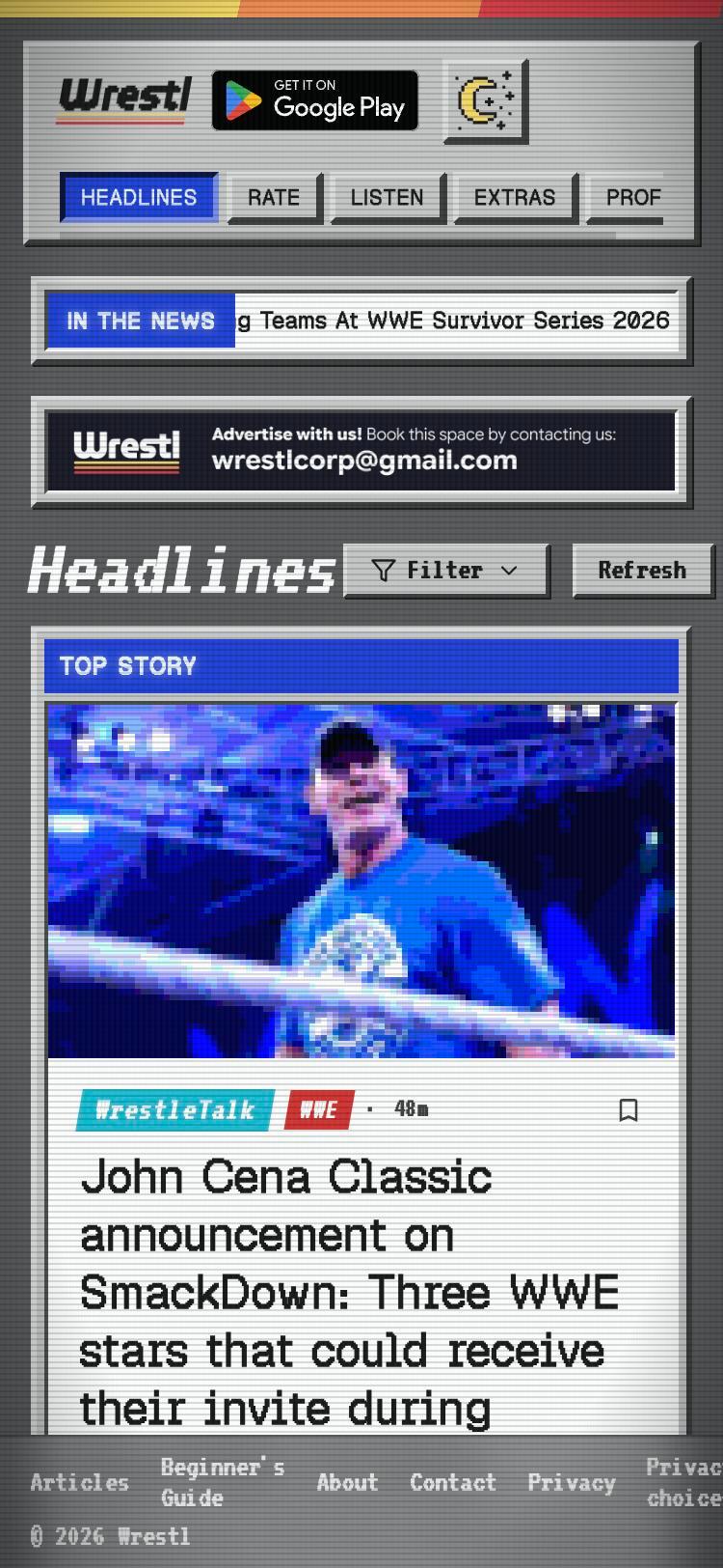
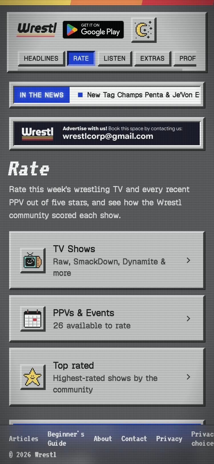
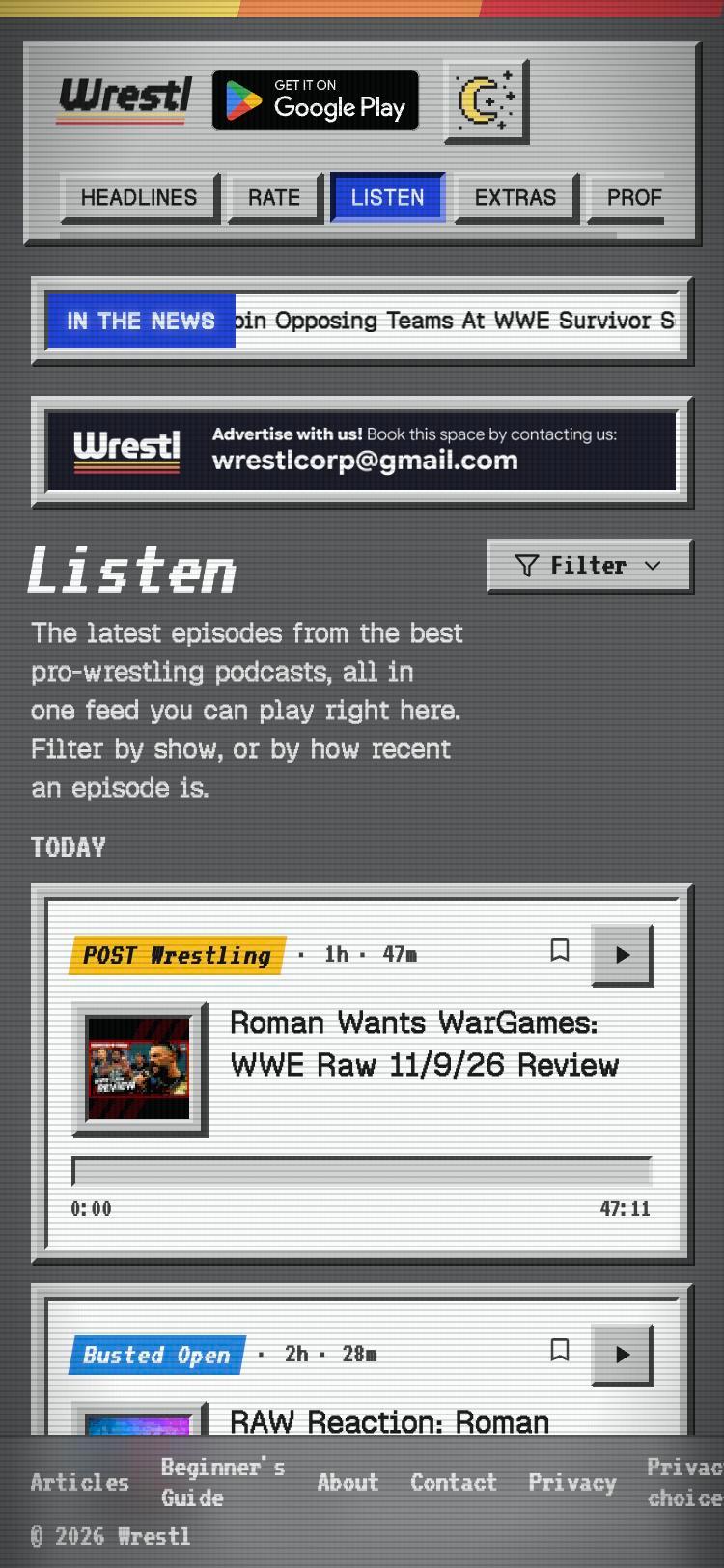
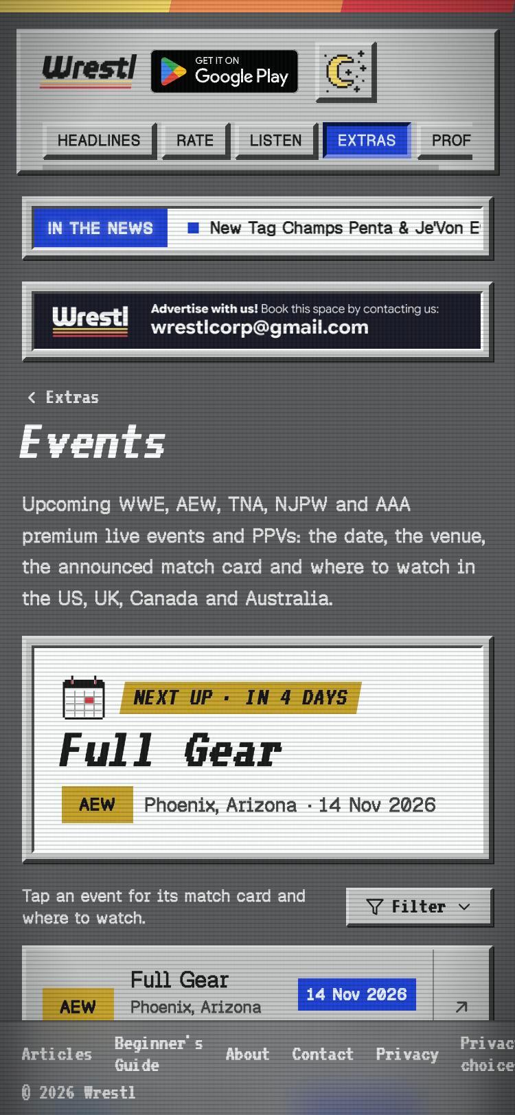
Wrestling fandom runs on nostalgia: tape trading, Saturday-morning TV, magazine covers. Instead of another clean, generic news app, I leaned into that. The interface uses chunky bevelled panels, scanlines, pixel-art icons and a broadcast-style "In the news" ticker, so it feels like a channel you tune into.
The personality stays at the frame. Inside every card the type is large and readable and the hierarchy is simple: source, promotion and time, then the headline. The retro styling never gets between a fan and the story.
Key design decisions
- 01
One feed, two filters
Headlines from 14 sources merge into a single chronological feed. Chips filter by source or by promotion (WWE, AEW, NJPW, TNA), and stories you've read fade back so the new ones stand out.
- 02
Ratings with half-star precision
Fans rate each airing of Raw, SmackDown, Dynamite and every PPV, Letterboxd-style. Your score sits in gold beside a live community average, and a Top Rated leaderboard gives everyone a reason to come back after a show.
- 03
No login, on purpose
Anonymous auth keeps ratings honest without a sign-up wall. Bookmarks, reminders and playback progress stay on the device, which also made the privacy story simple to tell in the store listing.
- 04
A reader that respects the reader
Articles open in an ad-free reader mode set in Wrestl's own typography, with a one-tap fallback to the original page.
- 05
Accessible by default
Large touch targets, readable contrast inside the retro chrome, screen-reader labels, and support for the phone's light or dark theme.
- news sources in one feed
- 14news sources in one feed
- platforms from one design intent
- 3platforms from one design intent
- accounts needed to use it
- 0accounts needed to use it
Designing and building it myself
I took Wrestl from the first sketch to shipping. I designed the system, then built it as a Next.js web app and a native Kotlin/Jetpack Compose Android app, with a SwiftUI iOS port underway. Owning the code meant design decisions never got lost in handoff. When a pattern didn't feel right in the hand, I could change it the same afternoon.
It also taught me the realities a designer usually only hears about: offline caching, flaky RSS feeds, notification limits and store review.
Taking the brand to Instagram
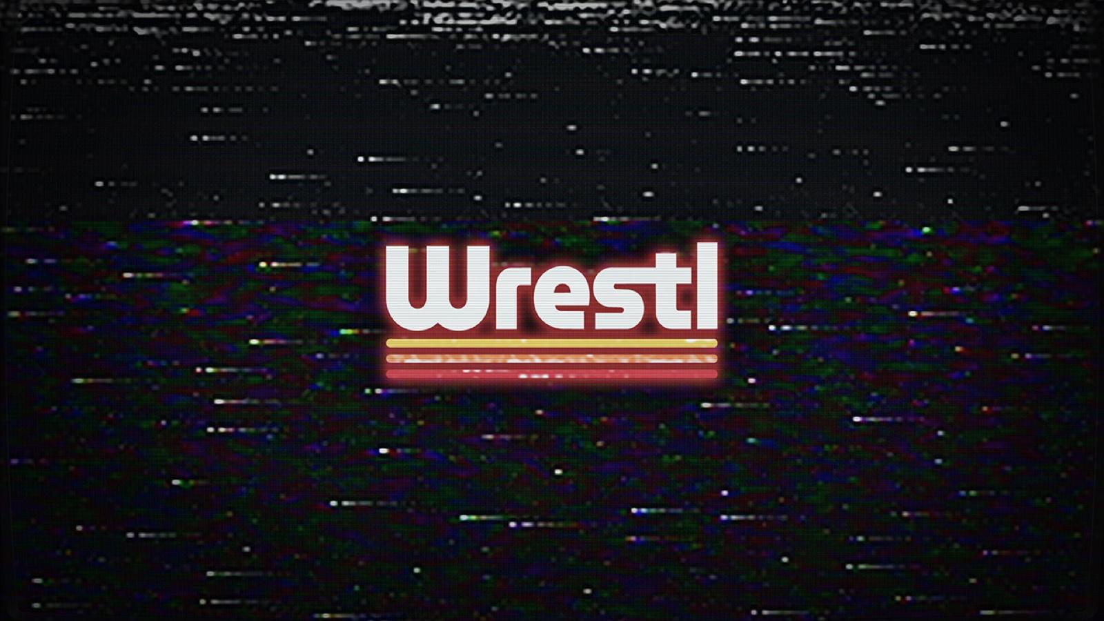
To promote the app, I edit short-form Reels for Wrestl's Instagram, @wrestlcorp. They're built around puroresu, hardcore and grudge matches, cut to music and finished with the same VHS static and tracking noise as the Wrestl banner, with the W mark stamped in the corner.
The look matches the product's personality: "raw tape aesthetics and old school violence", as the account bio puts it. Someone who finds Wrestl through a Reel should land in an app that feels like the same channel.